Control Types & Attributes
The library supports different controls which you can create in a new form initialized from a config file. A variety of controls:
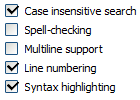
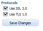
- checkbox - for multiply checkbox selections (there is the possibility to nest elements)
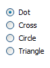
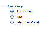
- radio - represents radio-button (there is the possibility to nest elements)
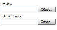
- input - for text input field and text area
- select - for dropdown lists (there is the possibility to nest elements)
- label - represents text label
- file - for file upload control
- button - represents normal button
- hidden - represents a hidden field. The field is invisible for users and its value is specified by the 'value' attribute.
| checkbox | radio | input | select | label | file | button |
|---|---|---|---|---|---|---|
 |  |  |  |  |  |  |
The listed controls have the following attributes:
- name - the name of an element
- type - the type of an element ('ftype' in case of an HTML initialization)
- label - the text label for an element. In case of an HTML initialization a tag value is used
- value - the value of an element (input, checkbox, radio, hidden, button)
- checked - the state of a checkbox or a radio element (true/false)
- style - the style for an element label (like “text-weight:bold;color:green;”)
- class - css class to apply to an element (a form element and its label)
- command - the default action for a button
- align - the align of the text in input (left/right)
- rows - the number of rows for input (behaves like textarea)
- width - the width of an element (input, select, button, file)
- connector - url of the server-side script which provides 'select' control options dynamically (for select type only).
- bind - the name of a database field an element should be bound to. Work for HTML form tags also.
- validate - a validation rule (see list of possible validation rules).Work for HTML form tags also.
In case of JSON initialization there are also:
- list - the array of nested elements
- options - the array of select list options objects, which have 'value', 'text' and 'selected' properties
By if you need combine several sense-connected controls, you can use 'fieldset' dhtmlxForm property.
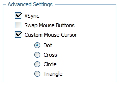
The code of the shown above form is:
{type: "fieldset",  name: "mydata", label: "Advanced Settings", list:[
		    {type: "checkbox", name: "vsync", label: "VSync", checked: "1"},
		    {type: "checkbox", name: "mouse_invert", label: "Swap Mouse Buttons"},
		    {type: "checkbox", name: "custom_cursor", label: "Custom Mouse Cursor", checked: "0", list:[
				{type: "radio", name: "cursor_value", value: "dot", label: "Dot", checked: "1"},
				{type: "radio", name: "cursor_value", value: "cross", label: "Cross"},
				{type: "radio", name: "cursor_value", value: "circle", label: "Circle"},
				{type: "radio", name: "cursor_value", value: "triangle", label: "Triangle"}
		     ]}
]}
And the full example that contains the mentioned form you can find here.
See also the configuration details: